Common UI: Action Bar
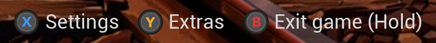
When the user interface is open in most modern games, you’ll find a list of actions available to the player. This is typically a horizontal bar located at the bottom of the screen.
Here are some examples:
Destiny 2

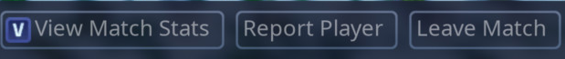
Animal Crossing: New Horizons

And, of course… Fortnite!
The Common UI plugin was originally developed for Fortnite and the action bar we’ll be creating in this tutorial is the same as the one used in the game! In case you’re not aware, this article is part of a series about the Common UI plugin. Common UI is a cross-platform UI plugin developed by Epic Games for Unreal Engine.
Setup
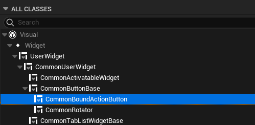
1. Common Bound Action Button
First, we’ll need to build our own button widget that will be used by the action bar for each available action. Go ahead and create a new Widget Blueprint based on CommonBoundActionButton.
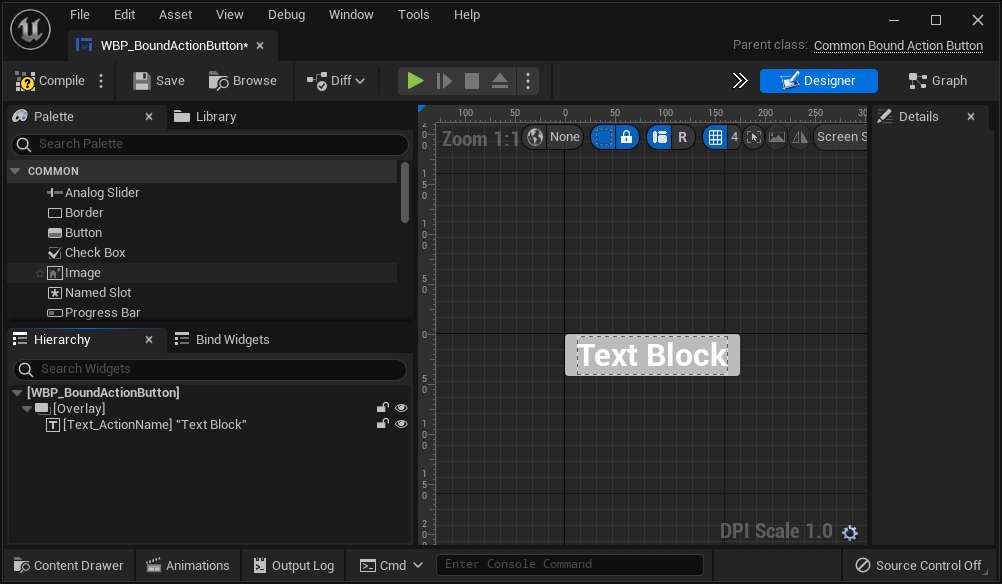
Just like with the CommonButtonBase, we’ll need to provide a layout for the button. In the Bind Widgets panel, the properties required by the parent CommonBoundActionButton class are listed here.
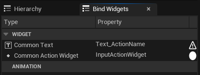
This means our button must have a Common Text widget and it must be named Text_ActionName, or else, it will fail to compile.
Let’s start off with an Overlay and a Common Text.
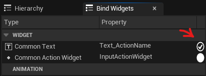
At this point, if we go back to the Bind Widgets panel, we will see a checkmark indicating that the property is bound.
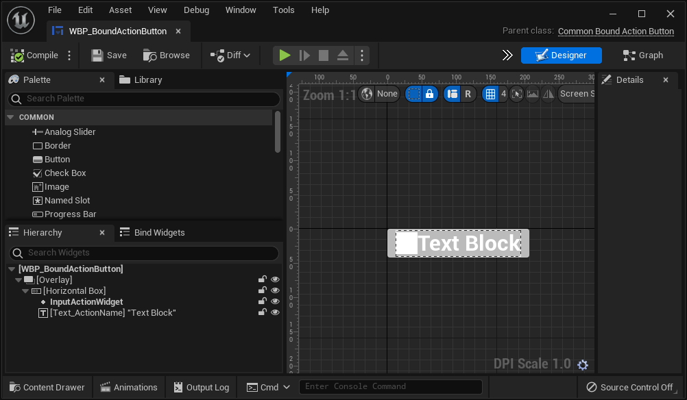
This part is optional, but in this tutorial we’ll add a Common Action Widget, name it InputActionWidget, and put it in a Horizontal Box along with the text. This widget will automatically display the input icon associated with the action.
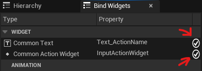
The Bind Widgets panel will update to confirm that the icon is also bound.
There are additional properties that can be set in the Details panel for the Common Action Widget.
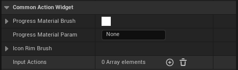
| Property | Description |
|---|---|
| Progress Material Brush | The material used to draw the progress indicator for actions that require holding down input. This is drawn on top of the button icon. |
| Progress Material Param | The name of a scalar parameter used by the material. A percentage value between 0-1 will be provided via this parameter. |
| Icon Rim Brush | The image or material that's drawn behind the button icon. |
2. Common Bound Action Bar
Put the Common Bound Action Bar wherever it makes sense in a widget blueprint. A good place is in your game’s root UI container widget. In this tutorial, we’ll put it underneath a Common Activatable Widget Stack that we’ll use to push activatable widgets.
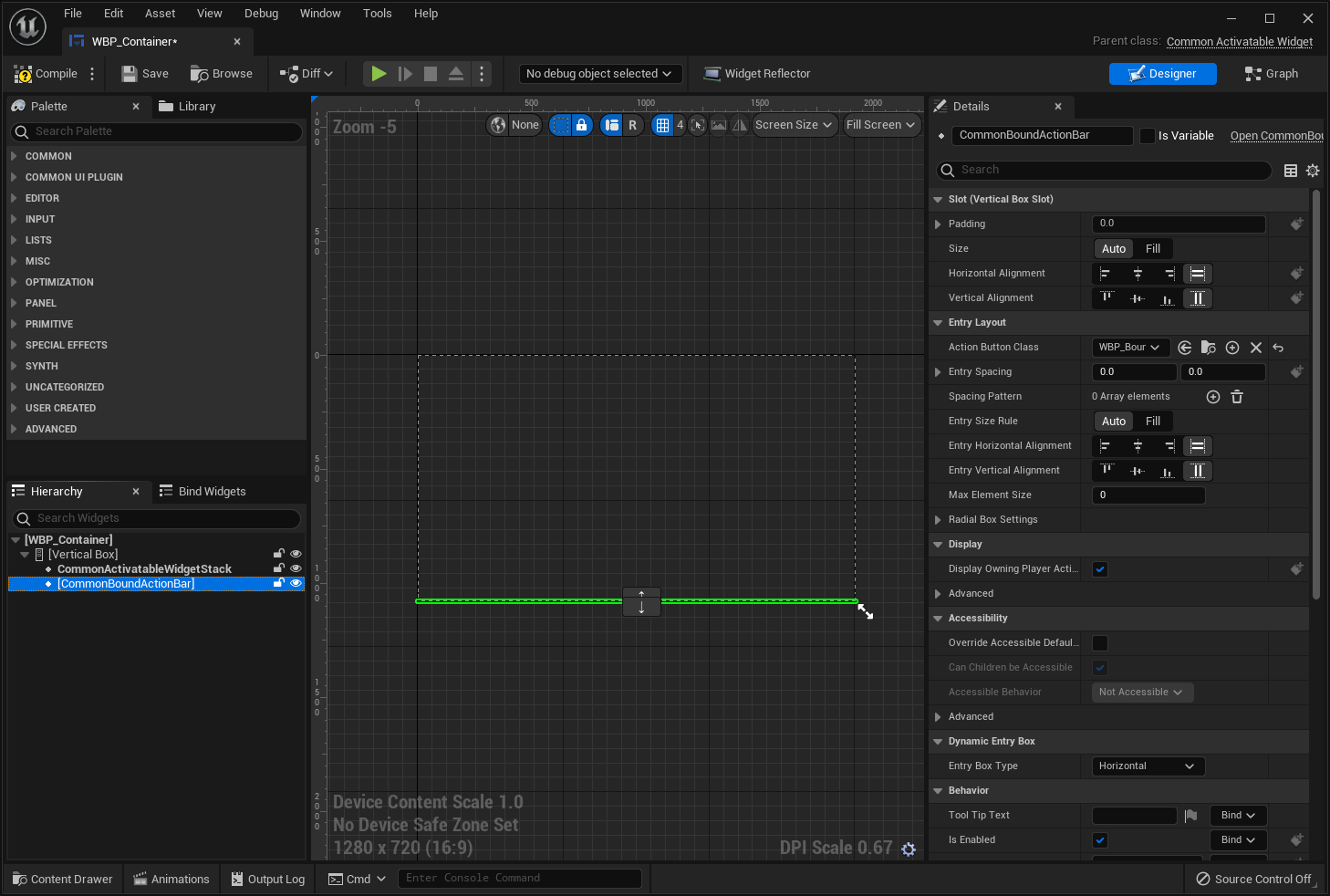
Under Entry Layout in the Details panel, set the Action Button Class to the button widget we created earlier. Under Dynamic Entry Box, the Entry Box Type property sets how the buttons are laid out. This can be further customized with the properties under the Entry Layout category.
The action bar works out of the box so there’s nothing else you need to do here.
Input Action Icons
Let’s do a quick run through on how to set up input action icons for each controller type.
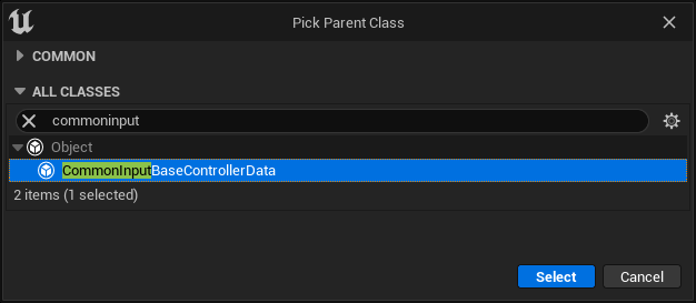
Create a Blueprint and select CommonInputBaseControllerData as the parent class.
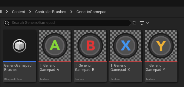
We’ll create one to represent the Generic gamepad which is used as the default in case we do not have one specific to the gamepad that’s being used. Import an icon for each button as a texture.
This needs to be done for each input device you want to support.
In the Blueprint, add an entry for each input type to the Input Brush Data Map.
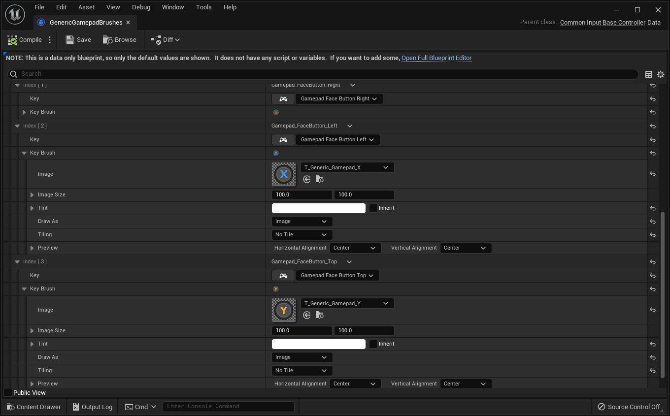
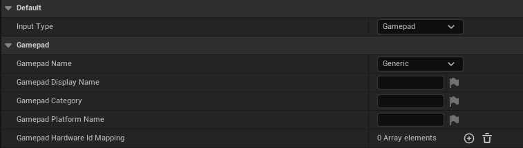
For the Generic gamepad, the Input Type is set to Gamepad and the Gamepad Name is set to Generic. If you have source code access to consoles in Unreal Engine, then you’ll see other options for gamepads belonging to specific consoles such as the Xbox or Nintendo Switch here.
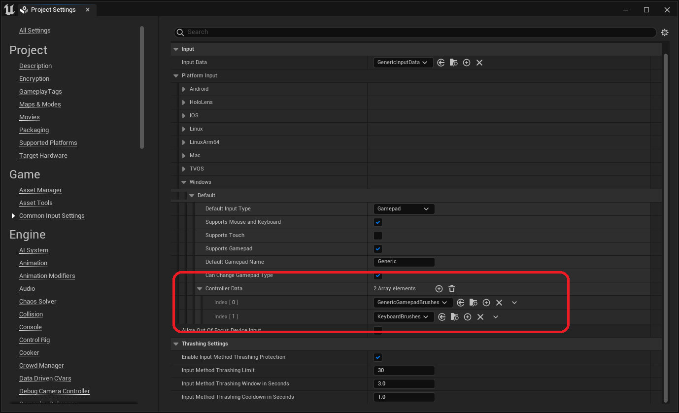
Now, open Project Settings > Game > Common Input Settings. For each supported platform (Windows in this example), add a reference to the relevant Controller Data assets. On platforms that support generic gamepads (e.g., Windows), make sure the Default Gamepad Name is set to Generic, otherwise, use the selected name in the Controller Data asset.
At this point, Common Acton Widgets will automatically display the appropriate icon based on the active input device.
Registering Actions
Back Handler
Common Activatable Widgets can register a binding for the default Back input action by setting Is Back Handler to true. The default behavior is to deactivate the widget. This can be changed by overriding the On Handle Back Action function of the Common Activatable Widget.
To display the Back input action in the Action Bar, both Is Back Action Displayed in Action Bar and Display in Action Bar need to be set to true.
Custom Actions
While it’s straightforward to handle the Back input, it gets a rather tricky if you want to bind more inputs. This will require C++, but there is a workaround if you want to do it in Blueprints only. The workaround is to add invisible (zero-width) Common Buttons to a Common Activatable Widget.
Otherwise, you’ll need to jump into C++ and call RegisterUIActionBinding in UCommonUserWidget, which is, unfortunately, not exposed to Blueprints.
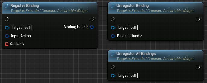
It’s not difficult to resolve this issue. My solution is to create a C++ class based on UCommonActivatableWidget and add BlueprintCallable functions so that I can register input bindings entirely in Blueprints as you can see below:
First, you’ll need to add CommonUI and CommonInput to PublicDependencyModuleNames for your game’s module. Then, add ExtendedCommonActivatableWidget.h and ExtendedCommonActivatableWidget.cpp to your game’s source.
The purpose of FInputActionBindingHandle is to represent an opaque Blueprintable handle provided by RegisterBinding that can be used to unregister the binding. This is optional as all bindings created by the widget will be unregistered when it’s destroyed, but can be useful in some cases.
Hope this helps!