Common UI: Switchers and Tabs
In this article, we’ll learn about the types of switchers in the Common UI plugin and how to leverage them to create tabs.
Common UI is a cross-platform UI plugin developed by Epic Games for Unreal Engine 5. There are few talks on YouTube covering the basics of Common UI and how it’s used in Lyra, but they haven’t explained how to create switchers, tabs, and carousels. There is a lack of documentation for Common UI that I’m hoping to help fill in here.
For that reason, this tutorial assumes you have a basic understanding of Common UI including setting up inputs and styling.
Switchers
A switcher is a widget that displays one child widget at a time and can switch to another child widget. It can act as a standalone widget or be linked to a tab list for a tabbed experience.
The Common Animated Switcher is derived from UMG Widget Switcher and animates the transition between child widgets.
At the time of writing, this widget describes itself as “a widget switcher that activates / deactivates CommonActivatableWidgets, allowing for associated animations to trigger.”
This is incorrect! The Common Animated Switcher does not activate widgets.
That’s where the Common Activatable Widget Switcher comes in. It is derived from the Common Animated Switcher, and makes it so that it does activate widgets.
Keep in mind that the next widget is not activated until the previous widget has transitioned fully out of view.
| Activatable Widget Event | Trigger |
|---|---|
| On Activated | Previous widget is fully out of view. This widget will be active while it's appearing. |
| On Deactivated | Immediately when switching. This widget will be inactive while it's disappearing. |
For both widgets above, there are four transition animations you can use:
| Transition | Behavior |
|---|---|
| Fade Only | Fade transition only with no movement |
| Horizontal | Increasing the active index goes right, decreasing goes left |
| Vertical | Increasing the active index goes up, decreasing goes down |
| Zoom | Increasing the active index zooms in, decreasing zooms out |
The only other transition parameters you can adjust are the curve type and duration. Anything else will require modifying SCommonAnimatedSwitcher.cpp in the Common UI plugin’s C++ source.
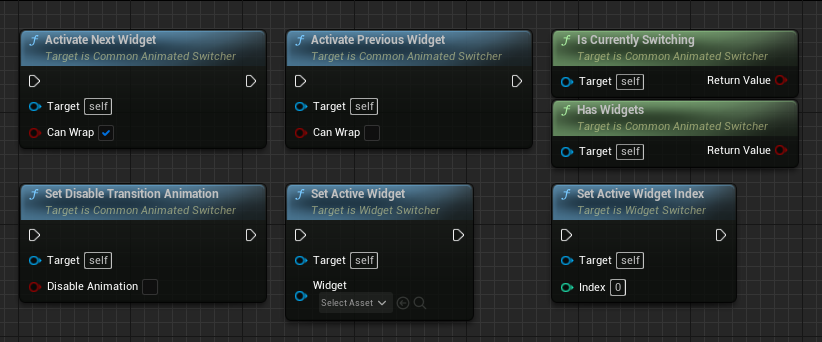
For your convenience, here’s an overview of all relevant functions you can use in Blueprints.
Finally, there’s the Common Visibility Switcher which is a bit different from above in that it is derived from UMG Overlay widget and is identical to UMG Widget Switcher in that there are no animations and only one widget can be visible at a time. However, it does activate widgets whenever they become visible.
Tabs
To create a tabbed experience, a Common Tab List Widget must be linked to a switcher. Only the Common Animated Switcher or Common Activatable Widget Switcher may be used with a tab list. Generally, you’ll want to use the Common Activatable Widget Switcher so that the input can be routed to the tab page’s contents.
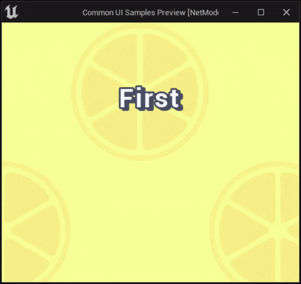
Show/hide animated preview

Set the value for Transition Duration to 0 for instant switching.
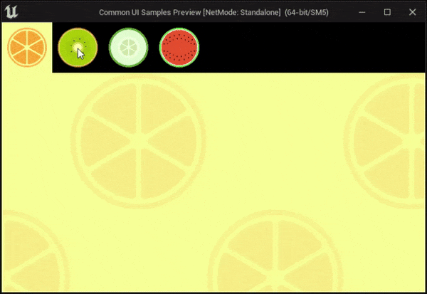
Show/hide animated preview
Common UI doesn’t provide a usable tab list widget out of the box, so there is a multi-step process to get it to work.
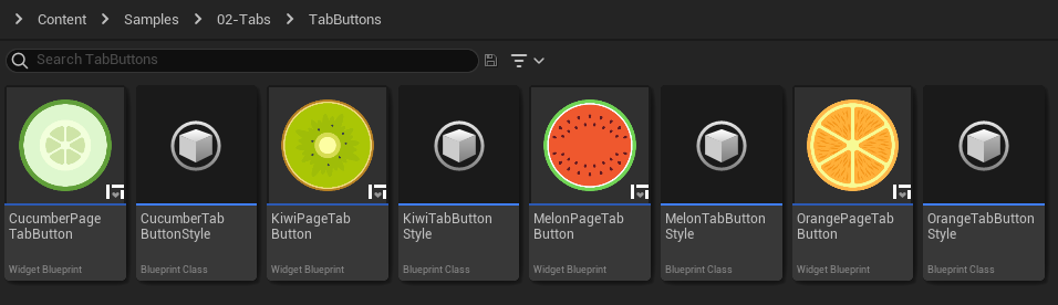
1. Tab Buttons
Create a button widget based on CommonButtonBase for each tab, or create a generic one and look up a data table based on the Tab Name ID input in the Handle Tab Creation event (shown below). In this tutorial, I’m doing it in the simplest way possible which is to have a separate button widget for each tab. There’s a unique style for each tab in my demo, but you likely will have one just style for all tab buttons.
2. Tab List
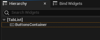
Create a Blueprint class based on CommonTabListWidgetBase. This will be the container for the tab buttons.
Add a Horizontal Box to the hierarchy and make it a variable. A Vertical Box can be used instead for vertical tabs.
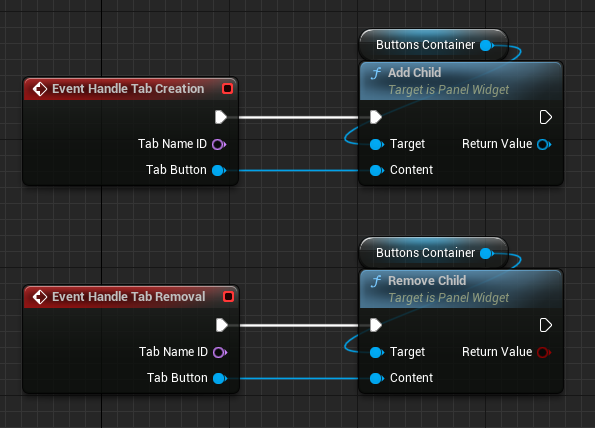
Open the Graph view. Override Handle Tab Creation to add the tab button to the container, and override Handle Tab Removal to remove the button from the container.
3. Linking to a Switcher
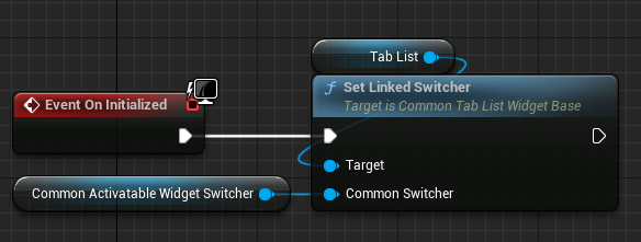
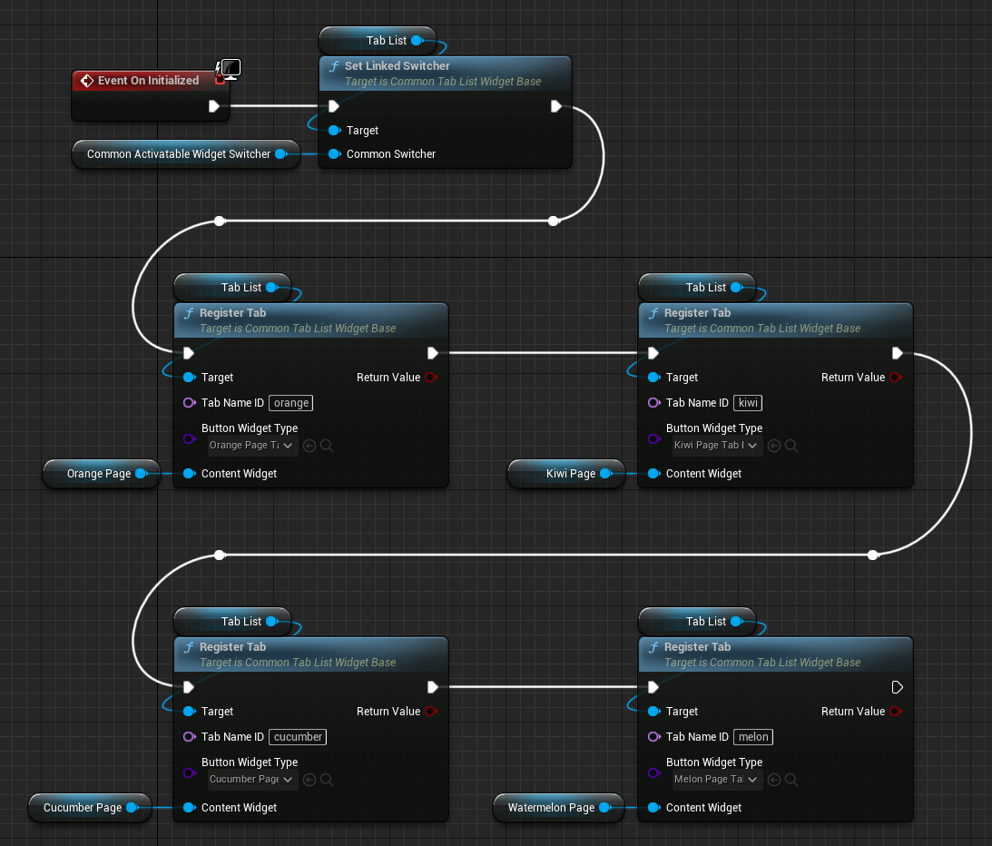
Open (or create) the widget that contains both the tab list and switcher. In the On Initialized event of this widget, link the tab list to the switcher.
4. Register Tabs
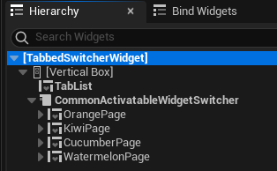
The switcher first needs to be populated with a widget representing each page.
Now, we can register the tabs. To register a tab, you need to specify a unique identifier, the tab button widget, and the content widget.
You’re all done here!
Carousels
A carousel is different from a switcher in that both the previous and next widgets are simultaneously visible during the transition. A switcher waits for the previous widget to fade out or move out of sight before bringing in the next widget. A carousel is much more like a scroll box where widgets are scrolled into and out of view.
Common UI has a Common Widget Carousel that may be optionally linked to a Common Widget Carousel Nav Bar.
Unfortunately, I was not able to get it to appear in my UI. It does scroll through widgets as expected so it does technically “work”, but for some reason it never gets painted onto the screen in the editor or game. I spent a long time debugging and analyzing the source and still couldn’t understand why it’s not visible.
At this point, I believe it’s bugged and probably cannot be used yet. If anyone knows how to make it work, please let me know on Twitter: @unrealist_matt :)